
In this article, we continue our series on Competitions.archi, presenting a collection of articles on different architectural competitions. Today, we will be featuring the winner of the Reuse the Nymphaeum Competition – an article from Architecture Competitions Yearbook 2024.
____________________________________________________________________
„Husch husch“ is an onomatopoeic word in the German language that describes the act of doing something so fast and superficial that it makes a whooshing sound. It’s widely used with a negative intonation as things that are done „husch husch” tend to be prone to error. When I was a child my grandmother used this particular word to describe my way of doing my homework – not focussing on the necessary depth and detail to maintain good quality in my work.

Since then I took great pride in the fact that I have gotten rid of this attribution in my daily architectural work. But when I started doing competitions, I soon realized that being able to do something „husch husch“ can also be a valuable skill that prevents you from losing time and energy on unnecessary details that won’t contribute to the general idea of a project. Being able to do a project like this will also obviously lead to faster results even if that means that you might sacrifice a minor detail here and there – do you really need to lose sleep over your line weights, if the building concept is just really amazing?


As I’m currently splitting my work time between being lead architect in a well-known office here in Berlin and teaching at the Technische Universität Berlin, all whilst working on my own doctorate in a design-based PhD program, it is paramount for me to do the competitions I participate in as quickly and efficiently as possible.

Working out a project quickly requires a few additional skills that are not easy to attain: one of which is committing to one idea of the project in order to be able to figure out how to present this particular aspect of the project in the best way possible whilst not getting sidetracked. This might be an easy task for people who do not have a doubtful nature. As I’m a person who is born with a tendency to overthink and have doubts, it’s sometimes a quite difficult task to convince myself to stick to an idea. But over the years I have learned that having doubts about my work is one of the darker valleys of my creative process that I need to walk through, trusting that sticking to an idea until the very end is usually the right decision.

The second peripheral skill I discovered to be important to quickly work out a convincing project is to develop a structured and strategic mindset that allows you to have an overview of the things that need to be delivered to convey the project. To do so, it’s not only important to work out what drawings, schemes and images are required to fulfill the competition brief, but also to have a clear strategy about the atmosphere of the images, the level of detail of the drawings and the layout of the competition panel. Developing this strategy early on and sticking to it makes it easier to not get sidetracked during the sometimes chaotic process of designing a building.

When deciding to work on the competition for the reuse of Bramante’s Nymphaeum in Genazzano, I followed this strategic approach. A very talented friend of mine won second prize in an earlier edition of the Reuse-Italy competition, which made me follow their recurring editions. It was not the first competition that I thought about participating under my own name, but whenever I read a brief, I try to see if an intuitive idea, that has the potential to be followed through, immediately arises.
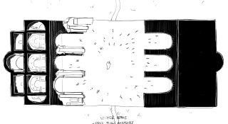
I discovered that the latest edition of Reuse Italy was issued just a few days before Christmas holidays. This was roughly a week off my other duties – a very limited time frame, which would build up enough pressure to work quickly. It;s exactly why I was keen on exploring the brief. When I looked at the drawings provided by the organizer, my first intuition was that the elevation asked to be completed in one way or the other. This was obvious because the building lay in decay for centuries and lost its original shape. When I went on to look at the Nymphaeum’s beautiful floor plan, I immediately felt that the geometric figure also did not feel complete in the horizontal direction. Given that the building was designed by one of the most important architects of the Italian Renaissance, I went on to assume that this particular feeling of incompleteness stems from the missing landscape design that must have undoubtedly surrounded the building to form a whole ensemble. So my first intuition was to repair the missing parts of the building to complete the lost sense of the whole. My wife is Italian and we were spending that Christmas in Italy, which certainly helped the decision to register for the competition and work on it during the holidays.
I called up one of my closest friends and an incredibly talented architect with similar values as me to work on the competition together. While explaining the task and my intuition of restoring a feeling of „wholeness“ I mindlessly brainstormed different approaches to explain what I meant. In this initial conversation I already mentioned the idea of not only fixing the ruin, but adding a volume that would create a dialogue between old and new. Due to bad timing, we could not collaborate this time and I decided to go forward alone.
After having seen a few students in University work seamlessly with tablets, hand drawings and CAD and given that I really enjoy drawing physically, I decided to experiment a bit and get myself a tablet to sketch on the go and try a digital workflow. Trying to explore this new tool, I gave myself the task to finish the entire concept of the competition by hand in order to only use CAD to draw up the final product once every decision has been taken after the digital sketches. This was also a strategic decision, so I could leave my Laptop at home over the Christmas holidays and sketch everywhere without a big setup: in the car during the drive, in the hotel during the nights or on the couch after family dinners.
The very first sketch I did on my tablet was a draft on top of the section of the Nymphaeum in order to explore proportions and restore the original volume. In this drawing I quickly discovered that I would like to focus on the central, oldest part of the building, which I went on to explore: I always trace the existing parts in varying levels of detail, as such drawing fuels my understanding. While sketching the original plan of the building I realized that the plan reminds me of a centralized plan of a Renaissance church, closely related to Bramante’s scheme for St. Peter – so I mirrored a copy of the floor plan and placed it in front over the original volume to form a beautiful symmetrical figure. That way the entire idea for the competition was born in the second sketch.
The following days, I did not actively work on the competition, due to my other obligations, but my mind was constantly busy. During this inductive phase of my creative process, my brain is continually chewing on the idea trying to manifest images of the design. This is not a very pleasant period, especially for those nearest to me, as it typically results in me either not having the mental capacity for interaction or talking about my ideas non-stop. In this process of mentally verifying the idea I’m trying to poke holes into the concept to see if it’s strong enough and I usually find lots of flaws and solve a lot of these problems already theoretically in my mind. In this process I feel the need to distract my mind as much as possible and I’m becoming very restless.

In this phase a very clear image arose: a red volume that mimics the original Nymphaeum and that I located directly opposite of the ruins to create a dialogue with the old. This pavilion was supposed to be lightweight and made from red timber, in order to be dismantled and minimize the impact on the site. The ruin was left to be absolutely untouched and everything that the theater needed was supposed to be housed inside the red pavilion. A lush garden between the buildings would enhance the natural atmosphere of the site.
Having found that main concept after only a few hours on the competition, I exported some base drawings on my laptop, because I knew I’d have to verify proportions and measurements while sketching. I built a very rough volumetric model of what I since then called „the twin“ and understood that the main work will be finding the right proportions, distances, volumes, material and level of abstraction. After a handful of sketches that already very closely resembled the final design, I worked mostly on understanding the right materiality of the intervention. At the same time, I decided to read a bit about Bramante to expand my theoretical background a bit and I discovered the text „Bramante’s problem“ by Pier Paolo Tamburelli in which he argues that Bramante’s approach to architecture was to shape the emptiness by giving order to the surrounding material. This struck a chord with me as in my PhD thesis I am working on the qualities of emptiness, void and absence in designing space. So after this lecture I decided to abandon the idea of the wooden „model“ of Bramante’s space in order to build a proper twin that would interpret my understanding of Bramante’s production of space. Therefore, the building had to have more presence, weight and impact which unfortunately did not match with my initial sustainable approach of a lightweight and reversible structure. But for me it was always more important to work out the strongest spatial idea even if that meant sacrificing objective benefits. So the building had to be massive.

In the screenshots of the 3D Model that I sketched with, the twin was a bright red color as I imagined previously. But I soon understood that the twin would outweigh the original building not only physically but also visually, which is why I decided to follow a softer approach and give the intervention a subtle, light monochrome appearance that would also underline the reduction of spatial elements that I desired. I strongly believe that in our times using ancient ornaments (if not for repairs) is not the right choice and that most spectators nowadays have the intellectual capacity for abstraction and for deciphering simpler shapes. So my goal was to design a model of Bramante’s space devoid of all unnecessary ornamentation and reinterpreted in a contemporary material. The first choice for this effect was to cast the entire space out of concrete. That later changed into the technologically absurd idea of In-Situ-Terrazzo. But then after a site-visit to Genazzano I reflected on the precise structural choice of material within the Nymphaeum and understood that the twin has to be made out of brick in order to honestly display the structural idea of the construction. More often than not I have to let go of an idea in order to decide the right thing that supports the overall concept and creates a stronger spatial expression.
Later in the process I struggled a lot with finding the right proportions to achieve the desired function of a performance space that required the distance between the stage and the spectator to be just right.

I obviously did not want to draw seats in the audience that would have a limited visibility. So I tried out a few different distances and sight lines between the audience and the stage until I was able to fit the required amount of seats in a triangular pattern without limited view. I was initially not happy with the odd arrangement of the seats but had decided to accept this solution. I later came to appreciate this very functional layout very much as it added an additional spatial direction to the space, even though it was initially against my desire for order and simplicity in plan.
Throughout the entire process I actively tried to switch the medium as much as possible. I drew intuitive sketches of the same viewpoint over and over with varying levels of detail, verified the idea in floor plans, sections and elevations, sketched over 3D models or tried to set up the first ideas for perspective renderings. Everything I did so far was hand sketching, even already sketching out a possible layout. Additionally there was a collateral call to the competition organized by Poiesis of Space that asked for a spatial drawing based on the floor plan of the Nymphaeum. As I’m also focused on exploring space within my doctorate through a particular way of drawing central perspectives with cross hatching lines that are 0,5mm apart, I decided to produce one drawing for this independent call. This drawing took around 12 hours to hatch but this extremely repetitive and painful but also meditative task allowed me to explore the space and the idea of the project in an extreme level of detail. The final drawing that I submitted to the collateral call differed still from the final project.

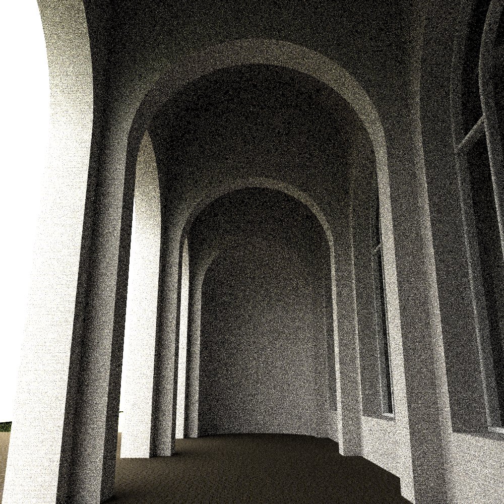
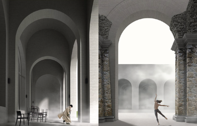
After returning to CAD, I had a tight deadline of only a few days of working at night. I focused on modeling the building in 3D in order to take the important detail decisions that would be visible in the renderings while preparing everything for the rendering process. My approach to creating visuals is generally to focus on a few key details that would create a sense of the haptic qualities of the building and create a strong atmosphere. I see competition panels as divided into two parts: the technical drawings that should be very abstract while answering all geometric questions and explaining the structural approach to the space and images that need to tell a different story and that should catch the spectators attention. My preferred approach is to create images with a great level of detail that have an interesting story to them. That is why I spent a considerable amount of energy in this last phase of the process to finalize the design in the 3D model. I’m making decisions based on construction, proportion and the desired effect in the rendering. While working on the model I often discover interesting points of view that match the atmospheric approach to the images. In this particular competition, the strong desire to produce a foggy image emerged. This was partly a strategic decision because most contestants would obviously use sunny images for their design in Italy, but I believed that the foggy atmosphere would display the reality more and hoped to stick out of the crowd a little bit that way. This way I could also skip the additional task of adding the surrounding landscape into the rendering. I nonetheless struggled with the image a lot because my building did not have enough contrast or expression in volume to stick out in the fog and the building became very flat. That is when I added the horse that drew the attention of the spectator away from the building and made the eye almost search for the building in the image. This way I did not only create an atmospheric image but tried to keep the jury for a few seconds longer on my panels trying to understand what they see.
I am well aware that it is a risky strategy to hide your design in the fog only to make the jury members wonder what it is that they see. It is also a risky way of designing only following one intuitive idea from beginning to end and to work as fast as you can („husch husch“) while accepting mistakes and imperfections only to achieve the strongest result the fastest way possible – but in the end I’m very happy that it all played out and I’m thankful to have won not only the main competition but also the collateral call with my hand-drawing.

I’m very grateful that initiatives like Reuse Italy provide young architects, professionals or students, a platform to try out their design abilities outside of economic and political pressure and to provide the participants with the possibility to work on these beautiful projects.
In hindsight, if I was asked to summarize the entire process in a few sentences, I would probably start by explaining that I currently don’t have the time for additional work and that participating in any kind of competition would be a really stupid idea. Doing it nonetheless forced me to establish a way of working „husch husch“, whilst trying to stick with the one, simplest idea that I had in the beginning all the way until the end. To hone a simple idea until it reached an acceptable functional and theoretical level was not always easy: there was a lot of pain and doubt. The idea was so simple that I was convinced that there would be quite a few proposals with the same approach. I stuck to it though and decided to work out the design process for 90% of the time away from CAD. Sketching everything all the time by hand makes you really understand your project: perspective drawings from different angles, plans, sections, axonometric details help you develop every part of the project not only through the brain but also intuitively through the hand. At the end of the process I would always try to simplify as much as possible, while not being afraid to omit showing something. Most of the time you will be judged by what is on the panels – and not what’s missing. I believe that the simpler the architectural idea, the bigger the impact will be and the less drawings are necessary to explain your project. This is also what I believe made my proposal successful: the simplicity of the project, the drawings and the deliberate choice of creating mysterious but simple scenes that would catch the spectator’s attention for a second longer than the other proposals. Let’s see if that strategy will be successful more often in the future – I can’t wait to try it out again.
Author: Tobias Rabold
____________________________________________________________________
If you would like to ready more case studies like the one above please check our annual publication
Architecture Competitions Yearbook

The post How to win architecture competition? | Reuse the Nymphaeum appeared first on Competitions.archi.